 I found that this package design really called out to me. More so, I think it screamed at me, which is the perfect effect for an energy drink. The metallic colors stand out really well on a shelf and the huge type only contributes more to the effect. The mixture of the metallic white and cool blue along with the name Summit, give this drink a nice mountain theme. The cool colors suggest ice and snow, conveying the idea that this drink is cold and refreshing, a common theme amongst beverages. I would pick this energy drink against any others on the shelf, I just hope it tastes as good as it looks.
Monday, May 9, 2011
Journal 20: Package Design
I found that this package design really called out to me. More so, I think it screamed at me, which is the perfect effect for an energy drink. The metallic colors stand out really well on a shelf and the huge type only contributes more to the effect. The mixture of the metallic white and cool blue along with the name Summit, give this drink a nice mountain theme. The cool colors suggest ice and snow, conveying the idea that this drink is cold and refreshing, a common theme amongst beverages. I would pick this energy drink against any others on the shelf, I just hope it tastes as good as it looks.
Journal 19: Papyrus

Thursday, May 5, 2011

Tuesday, May 3, 2011
Journal 17: Handwritten Text
 I found it really difficult at first to find an advertisement with handwritten text. After that I realized that it was only because I was not looking hard enough. When I glanced down at my homework list on a Post It note everything clicked. The idea of script text gives a very personal touch to anything it is applied to. In this advertisement, it is talking about the qualities of the car being advertised. When handwritten text is applied, it gives off the feeling that the information being conveyed is coming from a personal source like a friend or family member. People are more likely to listen to the opinion of someone close to them than strict advertisements. With the use of Post It notes, the ad conveys the idea of receiving information about this vehicle from a friendly and reliable source.
Sunday, April 10, 2011
Journal 16: Graffiti
I found this on the Berlin Wall when visiting the East Side Gallery. The image shows the skyline of Berlin with several iconic buildings. However it is more of a political statement. One the left side of the skyline the West side is being portrayed with its nice tall iconic buildings. The East side however shows large run down industrial buildings billowing smoke out into the sky.
The whole image shows the contrast between how life was in the West versus how people in the East suffered from the rule of the DDR. There are many makings on the East Side gallery which convey the same idea, but I stumbled onto this one because it was the least obvious. I had to look at it for a bit to understand the meaning behind it and I believe that a lot of graffiti is similar in that respect.


Journal 14: Picture Story
There once was a place that had prime real estate...
 ...Until some idiots took over and made the people irate...
...They taxed them in fortunes, and cut the scholarly portions...
 ...Then gave them all weapons, just to see what would happen...
 ...But the people rebelled, and the villains were expelled.
Journal 13: 10 Must Haves


1) Any form of writing utensil has been the staple of language and art since the beginning of time. Without these nifty little devices we would still be stuck in the stone ages. Although our world has gone digital, we still use them every day.
2) Another must have item is the light bulb. as humans, we have a natural distaste for the dark. To think of a world without the light bulb would be rather hard to imagine these days. I mean, we even use them when it it daylight outside.
3) Ah yes, my favorite invention of all time: the camera. Since I first picked one up I have been amazed by these things. As I grew up, my fascination with cameras expanded. If my DSLR was a bit more practical, or my point and shoot was better, I would go nowhere without a camera.
4) It must be 2011 because I cannot live without this damn thing. Not that I am a text-a-holic but because of everything else it is capable of doing. With access to the internet at any given time it is like carrying a dictionary, encyclopedia, phone book, map, translator, camera, calendar, calculator, etc. with you at all times. A web connected cell phone is like having all of the knowledge of the world in your pocket waiting to be used at a minutes notice. It also makes phone calls too, which I guess is pretty cool!
5) This thing is my baby. I absolutely love to drive! Although I do not get to do as much driving up here in Flagstaff, the car is something that has allowed me to move up here in the first place. The invention of the automobile brought the country together very quickly. It enables us to travel our own directions and at our own leisure. The car is a staple in the founding of American culture.
6) I am not sure how I would live without my Post-It notes. These little things keep me in check at all times. Whether it is a to-do list, homework for the week, or some even that I need to remember, these guys never let me forget.
6) I am not sure how I would live without my Post-It notes. These little things keep me in check at all times. Whether it is a to-do list, homework for the week, or some even that I need to remember, these guys never let me forget.
7) There is really know concise way of explaining why the computer is so amazing. Instant access to any information you could possibly ever need, the digital storage of media which used to be analog, and the digital rendering of media are among the main reasons the computer have influenced my life. As an inspiring graphic designer and photographer, the computer in the most essential tool I can have at my disposal.
8) As a student, the jump drive has become something I cannot live without. It allows me to take my in class work back to my computer and vise versa. It greatly increases the speed at which I can get my projects done. Also, it is a good way to keep back ups of all my work.
9) Another invention a student can not go without is the printer. This allows us to turn our digital media back into a form of analog media which is the best way to have a hard copy. As a graphic design major this is another essential tool to have as many times we are required to create print advertisements, menus, flyers, posters, etc.
10) Many people have agreed that duct tape is one of the greatest intentions and I must agree. If almost any of the previous items were to break, chances are duct tape could help solve the problem.
Wednesday, April 6, 2011
Journal 11: Myth
Here is one I cannot wait to pick apart. The myth about owning a Prius or any hybrid car for that matter, makes you a better person. The hybrid car runs on both gas and electricity which sounds great if you are worried about making yourself feel better at the pump. However when you go home and plug this little thing in, you have to remember where you electricity is coming from. In most cases it is coming from yet another source of fossil fuels which continually contributes to global warming and the use of resources. It also does not change your lifestyle and make you better than everyone else. Don't be smug about your Prius, it does not make you better than anyone else. If you want to go green: buy a bike, ride public transit, fuel your car with corn, recycle, etc. Don't just buy a Prius and call it a wrap. Besides, you have to admit it's a pretty ugly looking car.
Oh, it is a myth because the general consensu seems to be that driving a hybrid makes you a better and "greener" person as implied by the automotive industry. The industry has a huge pull on the media, and that is one of the reasons Barthes would consider these advertisements to be myth.


Journal 12: Advertisement Writing

Sunday, April 3, 2011
Journal 10: Ad Colors
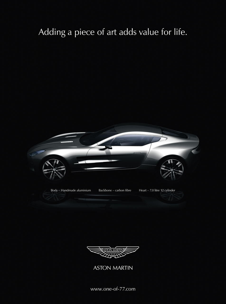 As with many different car advertisements. The white on black, dimly lit, white text signifies the elegance and class of this vehicle. The main idea of this add is that there was only a small number of these cars produced and it is a rarity to have one. Being an Aston Martin, they want to direct this ad to the elite class with the deep pockets. The silver of the car set on the heavy black background gives it a since of elegance which is perfect for their target audience.
Friday, April 1, 2011
Journal 9: Logo Colors
The is also another fairly easy one. The slanted text and the multiple "forward moving" lines indicate movement which is the exact thing that a shipping company wants their customers to think of when they see their logo. The yellow again symbolizes movement, energy, and speed; this company will ship your packaged faster than any of the competitors. Red again is another energetic color, but it also shows power which is another attribute that one may like t see in a logistics company. The logo as a whole might as well just scream the words "move" and "fast".
Rockstar has several different versions of their logo. This particular version uses the black to symbolize elegance. I believe this actually works with the title. Since a rock star lives life in a higher social standard, the idea of elegance is very well grounded. The gold yellow also contributes to this idea of high profile and importance. The yellow also symbolizes energy, which for an energy drink company is kind of important.
Thursday, February 17, 2011
Journal 8: Advertisements

This advertisement for AT&T is really visually appealing at first look. I believe that was the most important aspect that they were looking for when creating this advertisement. The images on the hands look like the Great Wall of China when first observed but on closer inspection the viewer can tell that they are actually hands with painting on them. This plays on the denotation because the image it what is being seen first then it changes after a moment or two. The significance of the Great Wall is important as the advertisement is promoting a new world wide service and the Great Wall is a very iconic global image for China making it a metonym cause this one single piece of architecture represents a whole nation which is undoubtedly filled with plenty of different walls.
Journal 7: Advertisements

This is a very interesting ad, just like most other advertising that come from Absolut. The first thing here that draws the viewer in is the motion of the breaking glass and the bright colors contrasted on a dark background. The connotation here is that the drink has such a strong taste that the glass containers are unable to contain it all. I think this is a clever advertisement. Most other alcohol advertisements simple show the bottle and a fancy glass half full of its contents. However this one makes the viewer take that image which has been engraved in our minds and watch it explode. There is a sense of elegance that can be taken from the bottle, the dark background, and the typography. However the addition of motion makes us think. “Wow, this drink must really pack a punch.” The advertisement signifies the potency of the taste which is something that the viewer would otherwise have absolutely no idea of just by looking at this printed media. I believe that is a sign of a strong advertisement, when the visual image can transcend the page and make the viewer use their senses to observe a product.
Wednesday, February 16, 2011
Journal 6: Opinion

It is a fairly simple idea, though I found it very hard to come up with something good without any words or use of typography. However I used the halftone effect on the revolver in order to convey the idea that the use of weapons and violence leaves us with skewed perceptions. We see the targets, but never the hearts.
Journal 5: Metaphor
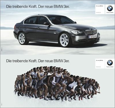
The text says "The driving power. The new BMW 3 Series."
I thought this was a cool example of metaphor. By giving the car the qualities of a hundred sprinters, it implies that this car is fast. The images show the runners creating the shape of the vehicle makes the viewer infer that the vehicle has the characteristics of these athletes. By seeing their action of running, one can see that they must be fast. The connotations allow the viewer to transfer those characteristics of speed to the vehicle. This is a good way of showing speed without being able to actually show this sports car speeding off into the distance.
Journal 4: Arrows


To be honest I was even more worried about finding the arrows than I was about the symbols. It seemed like I could not find any in and around the apartments. However that all changed when I got in my car to go to lunch. Suddenly there were so many arrows I couldn't even capture them all. My buddy and I joked that if anybody from another country tried to drive around in America they would have no clue where to go due to the abundance of arrows.
Arrows have a great way of capturing our attention. We naturally want to look in the direction they point in as if there is some sort of surprise they are directing us to. It seems as if everything is directing us and telling us where to go or where to look. Like there are some sort of visual roads upon which our eyes must travel. I have been seeing arrows everywhere since I have taken all the pictures. I cannot seem to avoid them anymore and I find it amazing that nobody else notices their abundance of appearances.
Subscribe to:
Posts (Atom)