Thursday, February 17, 2011

Journal 8: Advertisements


This advertisement for AT&T is really visually appealing at first look. I believe that was the most important aspect that they were looking for when creating this advertisement. The images on the hands look like the Great Wall of China when first observed but on closer inspection the viewer can tell that they are actually hands with painting on them. This plays on the denotation because the image it what is being seen first then it changes after a moment or two. The significance of the Great Wall is important as the advertisement is promoting a new world wide service and the Great Wall is a very iconic global image for China making it a metonym cause this one single piece of architecture represents a whole nation which is undoubtedly filled with plenty of different walls.

Journal 7: Advertisements


This is a very interesting ad, just like most other advertising that come from Absolut. The first thing here that draws the viewer in is the motion of the breaking glass and the bright colors contrasted on a dark background. The connotation here is that the drink has such a strong taste that the glass containers are unable to contain it all. I think this is a clever advertisement. Most other alcohol advertisements simple show the bottle and a fancy glass half full of its contents. However this one makes the viewer take that image which has been engraved in our minds and watch it explode. There is a sense of elegance that can be taken from the bottle, the dark background, and the typography. However the addition of motion makes us think. “Wow, this drink must really pack a punch.” The advertisement signifies the potency of the taste which is something that the viewer would otherwise have absolutely no idea of just by looking at this printed media. I believe that is a sign of a strong advertisement, when the visual image can transcend the page and make the viewer use their senses to observe a product.

Wednesday, February 16, 2011

Journal 6: Opinion


It is a fairly simple idea, though I found it very hard to come up with something good without any words or use of typography. However I used the halftone effect on the revolver in order to convey the idea that the use of weapons and violence leaves us with skewed perceptions. We see the targets, but never the hearts.

Journal 5: Metaphor


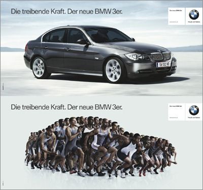
The text says "The driving power. The new BMW 3 Series."

I thought this was a cool example of metaphor. By giving the car the qualities of a hundred sprinters, it implies that this car is fast. The images show the runners creating the shape of the vehicle makes the viewer infer that the vehicle has the characteristics of these athletes. By seeing their action of running, one can see that they must be fast. The connotations allow the viewer to transfer those characteristics of speed to the vehicle. This is a good way of showing speed without being able to actually show this sports car speeding off into the distance.

Journal 4: Arrows


To be honest I was even more worried about finding the arrows than I was about the symbols. It seemed like I could not find any in and around the apartments. However that all changed when I got in my car to go to lunch. Suddenly there were so many arrows I couldn't even capture them all. My buddy and I joked that if anybody from another country tried to drive around in America they would have no clue where to go due to the abundance of arrows.

Arrows have a great way of capturing our attention. We naturally want to look in the direction they point in as if there is some sort of surprise they are directing us to. It seems as if everything is directing us and telling us where to go or where to look. Like there are some sort of visual roads upon which our eyes must travel. I have been seeing arrows everywhere since I have taken all the pictures. I cannot seem to avoid them anymore and I find it amazing that nobody else notices their abundance of appearances.

Journal 3: Symbols and Signs


I found all of these symbols in the general area of my apartment complex. It appears that I am surrounded by materials that could be potentially hazardous to my health. Many of the symbols that I have found during this assignment warn me and others of possible danger when using everyday items. It is weird to think that these simple things can be so dangerous but I suppose that we have simply become accustomed to the relentless warning these objects give us. Other items include the bear from the Berlin flag hanging in my room. A Pepsi logo, some instructions for the washing machine, and the Mustang logo from my car.

I was surprised at the fact that I did not have to travel far or spend too much time looking for these symbols. They are all around us, we have just become ignorant to their presence unless it is directed upon us.